Customization
Customizing Modifiers
ZoboUI also allows the addition of custom modifiers. To add a new modifier:
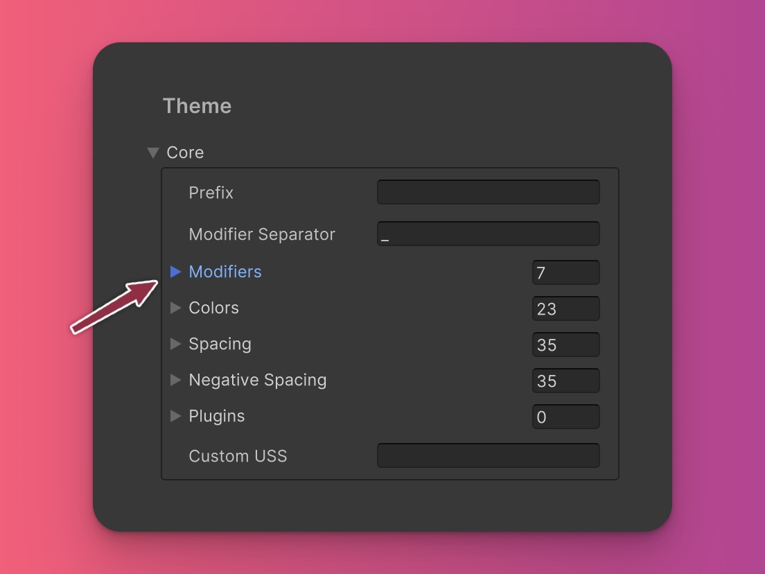
Open the Config Asset: Navigate to the ZoboUI configuration asset in your Unity project.
Go to the 'Core' Section: Within the config, locate the 'Core' section.
Navigate to the 'Modifiers' Option: Select the 'Modifiers' option to view existing modifiers.

Add a New Modifier: Enter the name for the new modifier and define the selector format using this template string: {{generated_class}}
Example: Creating a 'hocus' Modifier
Suppose you want to create a custom modifier named 'hocus', which applies styles when an element is both hovered and focused. Here’s how you would set it up:
- Modifier Name:
hocus - Selector Format:
{{generated_class}}:hover:focus
This setup would generate classes that apply styles when an element is simultaneously hovered over and focused, enhancing the interactivity and visual feedback of your UI components. For example, the following class would be generated:
.hocus_bg-zinc-900:hover:focus {
  background-color: #18181b;
}
And here’s how you would use it in UXML:
<ui:Button class="bg-zinc-800 hocus_bg-zinc-900" />
Changing the Modifier Separator
You can also change the separator used between the modifier name and the class. By default, the separator is an underscore (_). However, you can change this to another character or string, such as a double hyphen (--).
To change the separator:
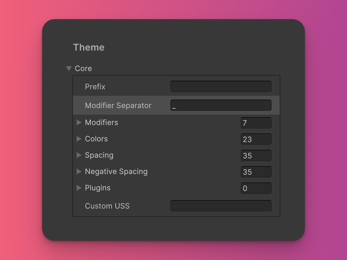
Navigate to Modifier Separator: In the ZoboUI config asset, head to the 'Core' section and find the 'Modifier Separator' option.

Change the Separator: Replace the default underscore (
_) with your desired separator, such as--.Generate the USS: Once you’ve made the change, click the 'Generate' button to update the generated USS file.
With this change, a class using the focus modifier would look like this:
.focus--bg-red-500:focus {
  background-color: #ef4444;
}
You would then use this class in UXML like this:
<ui:Button class="bg-red-500 focus--bg-red-500" />
This flexibility in defining the separator allows for greater control over class naming conventions, aligning with your project's style guidelines or personal preferences.
In conclusion, ZoboUI's modifier states provide a powerful and flexible way to create responsive and interactive UIs. The ability to customize and extend these modifiers ensures that your UI can adapt to specific requirements and behaviors, making your user interface dynamic and engaging. By leveraging these states, you can craft a user experience that is both intuitive and visually appealing, catering to a wide range of interaction patterns.