Utilities
Align Items
The Align Items utility controls the alignment of children on the cross axis of a container. This utility is essential for setting how items are aligned within their parent container, especially in flexbox layouts.
Utility Class | USS Properties |
|---|---|
| items-start | align-items: flex-start; |
| items-center | align-items: center; |
| items-end | align-items: flex-end; |
| items-auto | align-items: auto; |
| items-stretch | align-items: stretch; |
Usage in UXML
items-start
This places items at the start of the container's cross axis. It's like lining up items at the beginning edge of the container.
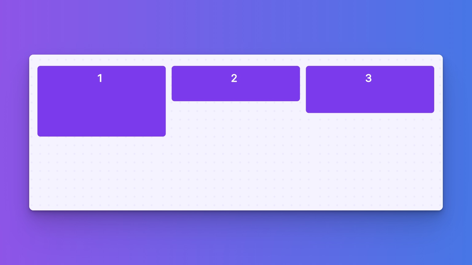
<ui:VisualElement class="items-start">
    <ui:VisualElement class=" w-1of3 h-24">
        <ui:Label text="1"  />
    </ui:VisualElement>
    <ui:VisualElement class="w-1of3 h-12">
        <ui:Label text="2" />
    </ui:VisualElement>
    <ui:VisualElement class="w-1of3 h-16">
        <ui:Label text="3"/>
    </ui:VisualElement>
</ui:VisualElement>
items-center
Using this class, items are centered along the container's cross axis. It's great for when you want everything neatly lined up in the middle.
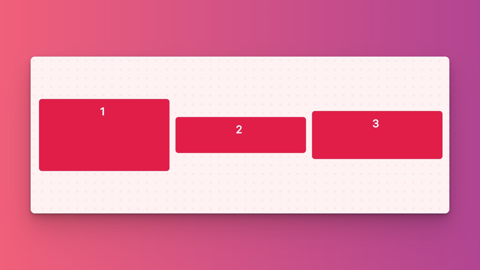
<ui:VisualElement class="items-center">
   <ui:VisualElement class=" w-1of3 h-24">
        <ui:Label text="1"  />
    </ui:VisualElement>
    <ui:VisualElement class="w-1of3 h-12">
        <ui:Label text="2" />
    </ui:VisualElement>
    <ui:VisualElement class="w-1of3 h-16">
        <ui:Label text="3"/>
    </ui:VisualElement>
</ui:VisualElement>
items-end
This aligns items at the end of the container's cross axis. It groups all items towards the far edge of the container.
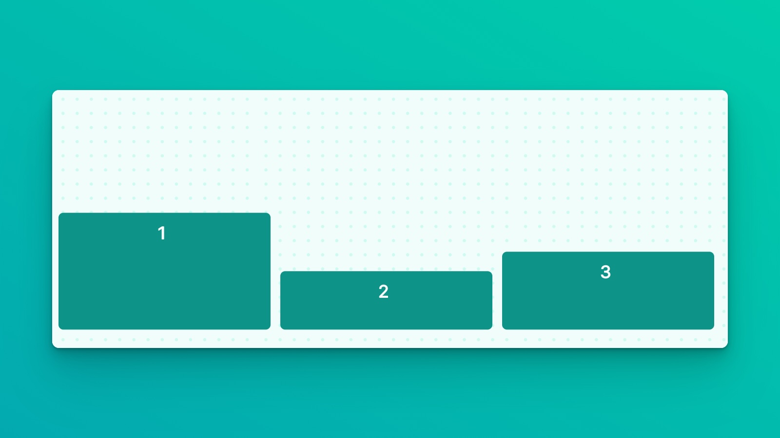
<ui:VisualElement class="items-end">
  <ui:VisualElement class=" w-1of3 h-24">
        <ui:Label text="1"  />
    </ui:VisualElement>
    <ui:VisualElement class="w-1of3 h-12">
        <ui:Label text="2" />
    </ui:VisualElement>
    <ui:VisualElement class="w-1of3 h-16">
        <ui:Label text="3"/>
    </ui:VisualElement>
</ui:VisualElement>
items-stretch
Stretches items to fill the container's cross axis if they are smaller than the container. This ensures that each item expands to occupy the available space, providing a uniform appearance.
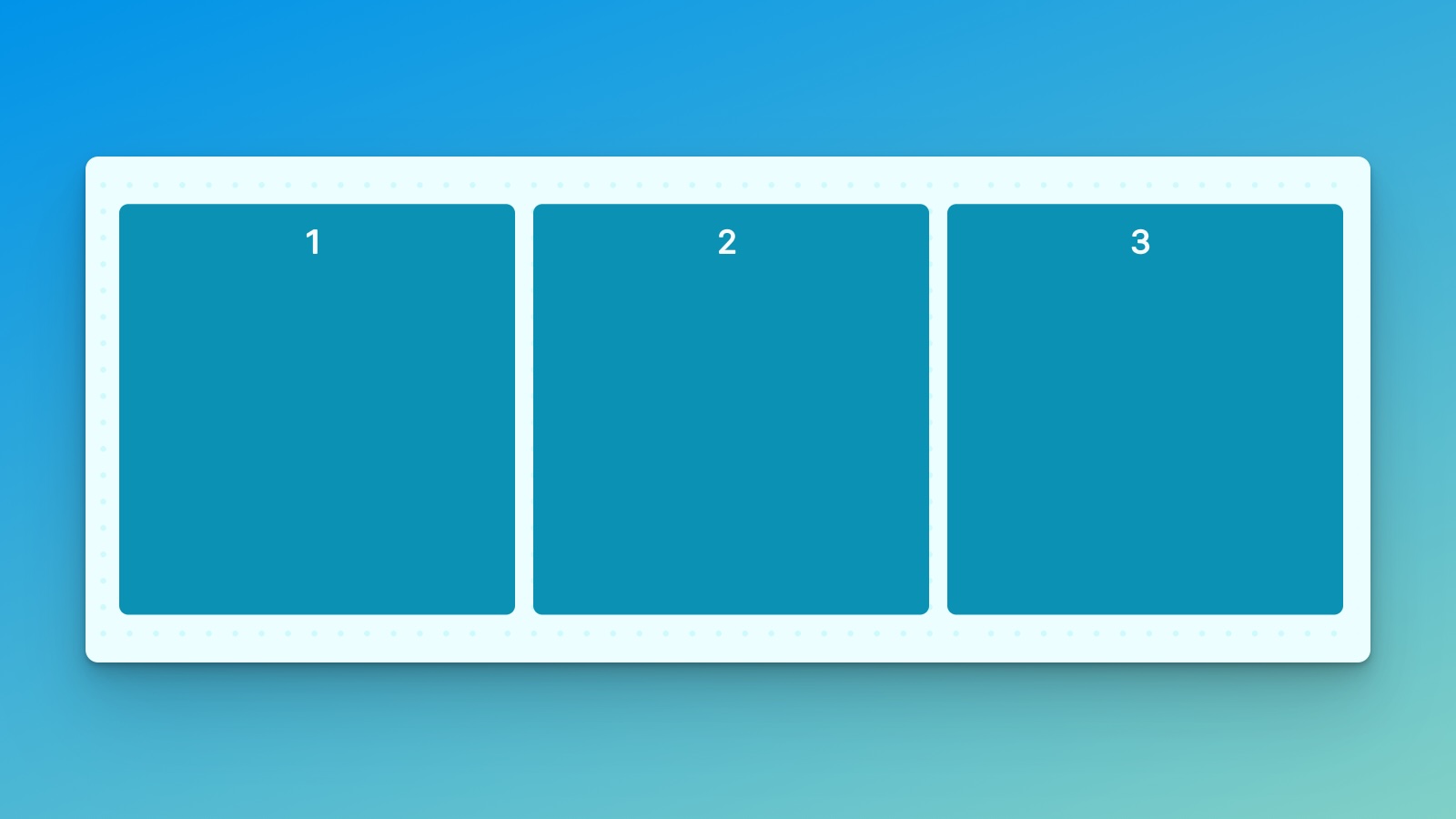
<ui:VisualElement class="items-stretch">
   <ui:VisualElement class=" w-1of3">
        <ui:Label text="1"  />
    </ui:VisualElement>
    <ui:VisualElement class="w-1of3 ">
        <ui:Label text="2" />
    </ui:VisualElement>
    <ui:VisualElement class="w-1of3">
        <ui:Label text="3"/>
    </ui:VisualElement>
</ui:VisualElement>
items-auto
This has the same effect as items-end. It sets the alignment to flex-end, aligning items against the container's end. This is useful when you want a default alignment towards the end.
Customize
Modifier Variations
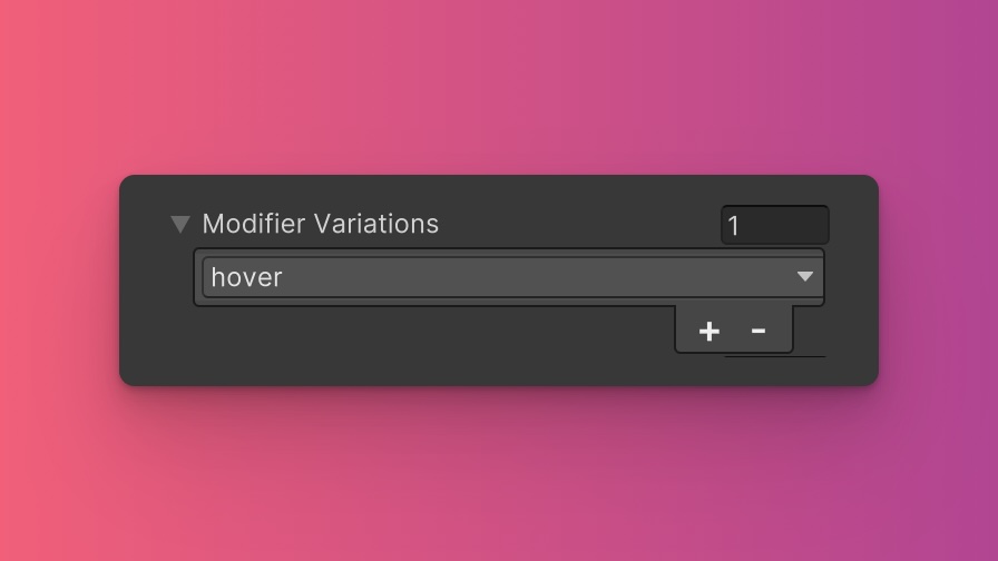
You can customize which modifier variations of the Align Items utility are generated, such as pseudo-classes (e.g., hover, focus) and custom modifiers.
Align Items utility.By fine-tuning the utility variations, you maintain control over your stylesheet's size and complexity, ensuring that only necessary styles are included. To update these values:
- Open the Theme Config Asset: Find the asset within your Unity project.
- Navigate to the 'Utilities' Section: Locate the
Align Itemsutility. - Adjust Modifier Variations: Select which modifiers you want to be generated for the utility. Keep in mind that the order of the modifiers will affect the order and specificity of the generated USS classes.
Class Tags and Properties
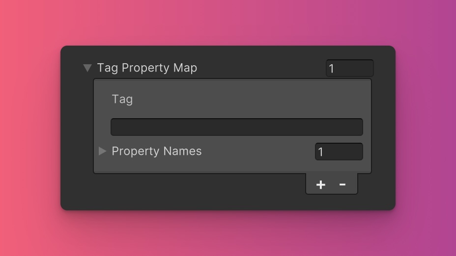
The Align Items utility generates classes based on predefined tags and their associated USS properties. While we recommend keeping these defaults for consistency and ease of reference in our documentation, you have the option to customize them to suit your project's specific needs.
These values are prepended to the defined values in this format tag-{value}. If a tag is empty, the generated class will simply be the value by itself.
Here are the default tags and the USS properties they set for the Align Items utility:
- items : align-items
To customize these tags and properties, you can edit the Tag Property Map field for the Align Items utility in the Theme Config asset. This allows you to define new tags or modify existing ones, thus tailoring the generated classes to your preferences.
Extending Core Fields
The Align Items utility does not extend any fields from the Core section of the Theme Config asset. Before you try to extend any fields, we recommend checking Unity's documentation to verify which types of values are expected by the relevant USS properties.
To customize or define these extended fields:
- Open the Theme Config Asset: Locate the asset within your Unity project.
- Navigate to the 'Utilities' Section: Find the
Align Itemsutility. - Customize Extend Fields: Modify or add fields in the
Extend Fieldsarray to change the core configuration values that are extended. You'll only be able to extend fields of the same type.
Disable Utility
The Align Items utility is enabled by default. You can disable it by unchecking the Enabled option in the Theme Config asset. This will prevent the generation of the utility's styles.